
Kitchen Countertop Backsplash Pairing: Which Element Should Lead
For a cohesive kitchen countertop backsplash pairing, start with the cabinets, choose the countertop next, and let the backsplash follow. The surfaces don’t need to match exactly; coordinating their undertones and giving each a distinct visual role helps the room feel balanced. With veined marble or quartzite, stacked subway tile can add clean lines and a quiet backdrop without competing with the stone.
Key Takeaways
- Choose a visual lead for the kitchen, then let the other finishes support it rather than compete for attention.
- Coordinate warm or cool undertones across cabinets, countertops, and backsplash to create a more cohesive palette.
- Balance dramatic veining with a quieter tile, or use contrasting textures to add interest without visual clutter.
- See how stacked subway tile can bring clean lines to veined marble or quartzite while keeping the stone in focus.
1. Should Backsplash Match Countertop or Cabinets?
You don’t need to match the backsplash exactly to the countertop or cabinets. A kitchen countertop backsplash pairing can coordinate through shared undertones or use contrast to define each surface’s role. The selection often begins with the fixed elements: cabinet color, floor tone, and appliance finish. These establish the palette, while the backsplash can connect those elements without copying any one of them.
To assess undertones, look beyond labels such as “white” or “gray.” Bright white cabinets can make creamy tile look more yellow, while a blue-gray counter may appear cooler beside warm flooring. Consider the whole room: warm wood cabinets may guide your palette toward warmer wall colors, while a cool-toned floor may call for a backsplash that bridges both finishes instead of introducing another strong undertone.
Your kitchen style also shapes the decision. In a traditional kitchen with detailed cabinet doors, a simple backsplash can keep the overall look settled. In a streamlined modern style kitchen, stronger contrast may add definition. Include appliance color in your plan: stainless steel often aligns with cool-toned materials, while black appliances can contribute a dark accent. Consider how prominent these finishes are and whether you want them to blend in or stand apart.
When your countertop has veining, use a quieter color within the stone to connect it subtly to the backsplash, rather than repeating the most prominent shade. Ceramic tile and stone are common backsplash choices near a range or sink, but suitability depends on the specific material and finish. Consider exposure to heat, moisture, and splashes, along with cleaning needs, before choosing a surface. The result can coordinate visually and suit your everyday kitchen use.
2. Balancing countertop and backsplash texture and finish
Balance texture by considering how each surface catches light and carries visual movement. A polished counter can feel sleek, while a honed backsplash gives the wall a softer finish. Pairing them creates contrast without adding another color. Let one surface provide visual energy and the other temper it. A kitchen countertop backsplash pairing feels balanced when sheen and texture work together rather than compete for attention.
Countertops with pronounced grain or veining often benefit from a backsplash with a quieter surface pattern. Smooth ceramic tile can calm the composition, while a subtle handmade texture adds depth without introducing another bold motif. If the counter is visually simple, a tile with a distinct shape or surface variation can bring interest to the wall. Consider the size and frequency of each pattern, not just its color.
For example, a linear countertop pattern may sit more comfortably beside tile with a softer, less regular texture than beside another strong grid. A patterned backsplash can also work with a solid countertop, keeping the overall mix easy to read. In smaller kitchens, related surface textures and restrained patterns can help maintain visual continuity. Judge the balance by how the materials look together across the full counter run and wall.
Use samples to judge those relationships before making your final selection. Tile and grout can be placed beside the countertop sample, then viewed upright to represent their installed position. This makes differences in sheen, texture, and pattern easier to compare. For a more continuous finish, a full-height slab backsplash carries the counter material up the wall. If that suits your design, full wall backsplashes can connect the counter and wall as one surface.
3. Choosing a focal point between countertop and backsplash
Begin by identifying the kitchen’s strongest visual surface from the main entry and work areas. Assess the countertop, backsplash, floor, and island as one composition. In many layouts, the counter or floor already carries the most visual weight. Choosing a clear lead prevents every element from competing equally. Give supporting surfaces a quieter role so the room feels composed rather than crowded.
A countertop can lead when its pattern or movement draws the eye. For example, granite with striking veining can become the focal point, while a subtle backsplash lets the stone’s natural variation stand out. Consider how much countertop is visible from nearby rooms. A large island may strengthen that feature, while a smaller counter run may leave more visual emphasis to the backsplash or cabinetry.
The backsplash can take the lead when the countertop is visually restrained. Patterned tile, a distinctive shape, or a full-height surface can create an expressive focal point. Keep the palette balanced by pairing that feature with simpler countertop and floor surfaces. Grout close in color to the tile softens the pattern; contrasting grout makes the layout more noticeable. Choose based on whether you want the tile’s shape or color to stand out.
Lighting and sightlines help refine the decision. A polished counter may catch light across an open kitchen, while a backsplash can stand out above a long work area. View the materials together under natural and under-cabinet lighting, then consider how the focal surface looks from the doorway and adjacent spaces. Give each finish a distinct role: a focal point, a supporting element, or a quiet background. This gives the eye a clear place to land without making other surfaces disappear.
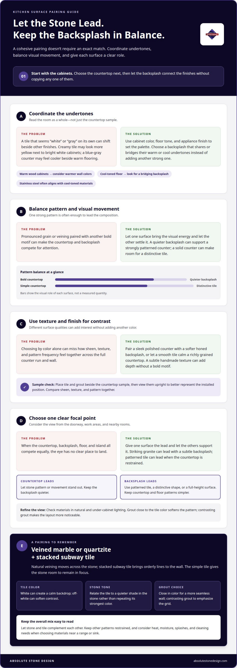
4. Pairing veined marble or quartzite with stacked subway tile
Quartz pairs well with ceramic tile, while granite can take a backsplash that echoes a quieter color in its pattern. Veined marble or quartzite benefits from simpler tile, such as white stacked subway tile. For butcher block, warm-toned tile can complement the wood without introducing competing patterns.
This combination works because the materials have contrasting visual rhythms. Marble and quartzite veining moves naturally across the surface; stacked subway tile brings orderly lines to the wall. White tile can give marble and deep blue cabinets a calm backdrop, while off-white tile can soften the contrast. The tile doesn’t need to repeat every color in the stone.
Start by identifying the stone’s dominant tone and secondary colors. Choose tile that relates to a quieter shade, then consider the grout and layout. Grout close in color to the tile keeps the wall looking more seamless; contrasting grout emphasizes the grid. Keep other patterns restrained so the stone and tile complement rather than compete with each other.
For a stacked layout, consider the wall’s size and the countertop’s visual scale. Subway tile creates clean lines, while larger tiles can reduce grout lines and create a simpler field. In a compact kitchen, appropriately scaled tile and a restrained palette help maintain continuity. View tile and grout samples vertically beside the countertop, since their appearance can shift on the wall.
For 2026, a considered combination is veined marble with white stacked subway tile, or quartz with ceramic tile in a coordinating tone. These are design directions, not rules; the stone’s pattern, cabinetry, and room scale guide the final selection.
Planning a stone-and-tile combination? Plan your countertop and backsplash pairing with a coordinated look in mind.
Absolute Stone Design: Countertops
Absolute Stone Design brings countertop and backsplash selections together through custom countertop fabrication and installation. For granite or marble, coordinating the stone’s veining with tile or a full-wall backsplash can shape the kitchen’s focal point and overall feel.
The process includes precision measuring and templating, in-house stone fabrication, delivery, and installation. This provides a clear path from material selection to fitted surfaces, with attention to how the countertop and backsplash relate in your kitchen. A full-wall backsplash can extend the stone’s visual presence, while a contrasting material can create a distinct transition.
If you’re ready to plan your surfaces, contact Absolute Stone Design to discuss your kitchen project.
Start shaping a kitchen that feels like yours
A thoughtful kitchen countertop backsplash pairing does more than coordinate finishes; it can express how you want the room to feel during everyday meals and gatherings. Before fabrication, settle on the mood you want throughout the kitchen: a quiet backdrop, a more pronounced stone feature, or a balance between the two. Those preferences give your material selections a personal direction.
Absolute Stone Design offers granite and marble countertops, with stone fabrication handled in-house. Your preferred colors, patterns, and overall style can guide the selection of surfaces that work together. Bringing your design ideas into the conversation helps keep the finished kitchen connected to your vision.
Ready to take the next step? Contact Absolute Stone Design to discuss your kitchen project. With a clear vision and thoughtful material choices, your kitchen can feel distinctly yours.
Frequently Asked Questions
Should you match the backsplash to the countertop or cabinets?
The surfaces don’t need to match exactly; your choice depends on which feature should guide the room’s palette. If your cabinetry is the main visual feature, a backsplash that relates to its color can create continuity. If your countertop has more character, let the backsplash support it instead. For kitchens in Richmond, Henrico, Glen Allen, Midlothian, Chesterfield, and Charlottesville, consider your cabinetry, counters, flooring, and lighting together before settling on the pairing.
Do Finishes Need to Match?
No. Different finishes can work together when the contrast feels intentional. A glossy backsplash can reflect light beside a matte floor, while a polished countertop and honed wall surface create a softer contrast. Surrounding colors matter too: an unexpected mix of warm and cool undertones can make finishes feel disconnected, even when their textures complement each other.
How Does Kitchen Style Affect Your Choice?
Your kitchen’s style helps determine whether the backsplash should blend in or add character. Subway tile can suit classic and modern rooms, while a distinctive tile shape can give a simpler kitchen a more individual feel. In a traditional space, a restrained pattern may preserve a familiar look; in a contemporary kitchen, clean lines can keep the design crisp.
Should You Use the Same Material?
Using the same material for your counter and backsplash can create a continuous, streamlined look, especially when the stone’s veining carries upward. It can also make a strong pattern more prominent across the wall. For clearer separation, choose a different backsplash material and let its color or texture relate to a detail in your countertop.
Should you choose a backsplash that is lighter or darker than your countertops?
Either direction can work. A pale backsplash can lift dark counters, while a darker wall surface can add depth beside a light countertop. If both your cabinets and counters are light, a deeper backsplash can introduce definition. If both are dark, a lighter, glossy tile can break up the visual weight, particularly in a kitchen with limited natural light.
How should you select a grout color for the backsplash?
Grout affects whether tile reads as a quiet surface or a distinct pattern. A grout shade close to the tile color softens the grid and keeps attention on nearby materials. Contrasting grout outlines each tile and makes the layout more noticeable. Compare grout and tile samples together, since the joint color changes the backsplash’s overall appearance.